Joe Packer – Joining and Continuing
An essay by Matthew Collings
Joe Packer was the winner of the 2018 Contemporary British Painting Prize. This essay, by painter, critic and broadcaster Matthew Collings, has been published in the CBP Prize 2018 exhibition catalogue. The essay forms part of the prize.
“At the house I grew up in,” Joe Packer says, “You could walk straight out of the back door into a wood. It was in a small place called Shottesbrooke in Berkshire. Childhood memories involve being in the enclosed, interior/exterior space of a wood. The filtering of light through trees and foliage.” He says his paintings are not of those places, but he thinks of them collectively as “some sort of landscape and somehow connected to places familiar to me where I grew up.”
His studio is in St Leonards on Sea, near Hastings. A seaside location suggests light and space, but it’s actually cluttered, smallish, with small windows, and he finds himself working mostly by strip-light. PitScape, the painting for which he won first prize, in the Contemporary British Painting Prize, 2018, is typical of his recent pictures, which all seem to be about emanation, light radiating from a certain point, not quite the centre. There are three of these paintings in the CBPP exhibition. In PitScape and Heartland the glow comes from the lower centre, and in Darklingthrush Wood 2, the origin is a zone in the upper half over to the right.
The paintings prioritise light and transparency, which sounds airy, and at the same time they have an unavoidably opposite character as objects. Their buildup of physically substantial paint, resulting in surfaces that glow but are also crusty and gnarly, is a meaning in itself. It tells you about his particular way of painting, as a process of finding or uncovering. Unearthing, digging up, revealing a rhythmic unity via an approach of bit-by-bit stumbling – it’s an interesting idea. It implies that ideas as such might be overrated.
He says of the imagined reality each painting offers that it is “contained within the paintings’ own internal logic.” They take a long time to finish and he typically has several on the go at once. There can be long gaps between sessions on a particular work. Sometimes he needs to stop caring about or being attached to what he already has. The end result in any one case tends to be an accumulation of several paintings.
In PitScape an inner frame can be made out. It has been painted-over at certain points. Marks brushed on in a certain loose structure over that partially submerged frame, in one session, were added-to in other sessions. Further marks gradually added over many sessions, caused these areas to build up into their own independent structures, related to but separate from everything else. Microworlds. A patterning that visually talks both to the main area of the painting and to its outer edge, and to itself.
The paintings share a sense of crude things: marks, shapes, contrasts of light and dark, that somehow find a way of bouncing around that makes visual sense. We see the world as subjects of it and as somehow outside it looking in: in the special way his paintings have of gradually coming into being he seems to be saying something about that. He offers atmosphere; memories of a place someone has known. Believable not because there’s proof we as viewers can consult. But because, even if there is no scene or view, the balance of elements in the paintings has a feeling of reality.
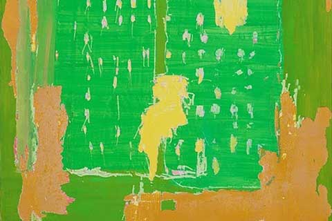
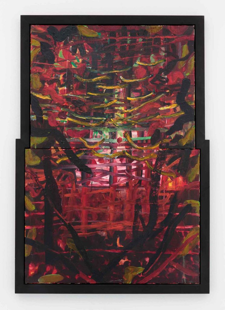
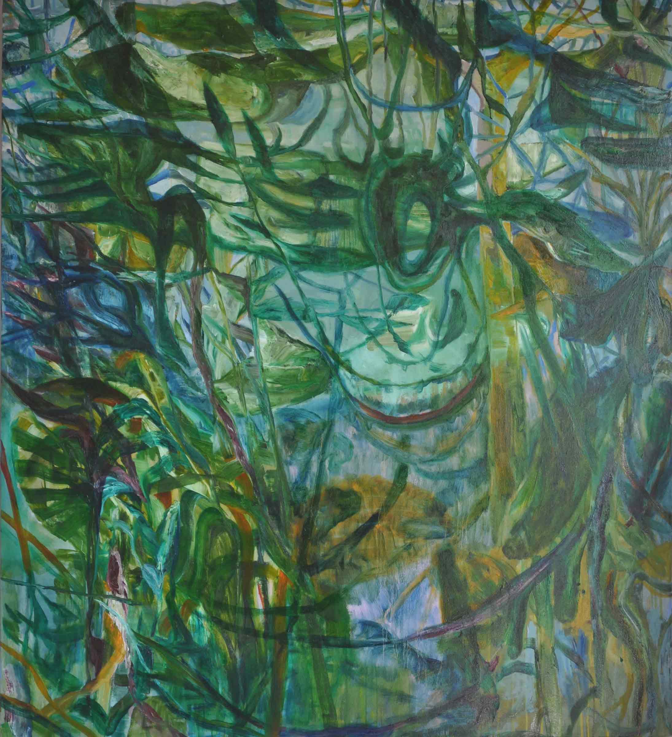
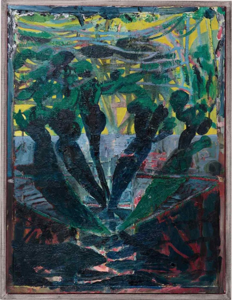
Each of the three paintings has something in it suggesting or resembling a visual property both the others have to some degree. The paintings feed off each other while also looking quite obviously different. A red one, a green one, and one with black. Next to Heartland, which seems all red, Darklingthrush Wood 2 is all green. Then when you’re “in” the latter it is clearly all blue atmosphere, and innumerable variations of yellow leading to green. It is not “all” anything but, rather, a web of differences. And Heartland when you are in it is deep crimson grading into all sorts of differences: into black, into dusky pink, bright pink, and light green. Light cascades in Darklingthrush Wood 2, from an area around a shape like a knot in a tree or an opening in a human body. It rises in Heartland, pushing out in the middle so the glow and space are both at maximum intensity there.
PitScape has black seaweed bladder shapes against light. Towards the bottom of the painting is the tentative beginnings of the grid that Heartland has with full-on strength. The scape could be sea or land. A pond, a swamp, a distant place, a jungle, the woods outside the door. One zone is a ghostly drained white. It has a band of black below with a curved edge. And above the white, which is really a muted dirty blue area made out of dash-shape little strokes, is a stinging yellow-green, holding within it tangles, fronds and pods.
A complication of the paintings is the weird way wooden frames are made pictorial. They seem almost organic as much as sawn-up and nailed. In Heartland the painted broken grid structure, is answered by a grid of frames, with surfaces glazed in the same way transparent effects in the painting itself are achieved by glazing. In a zany logic painted wood cuts into painted transparencies denoting a “wood.”
Heartland is like looking into gaps between boughs and leaves. It has a lattice or trellis structure, not streamlined but clearly recurring everywhere. Your perceptions are played with in relation to it. The painting might seem at first to have a geometric grid below and formless loose open marks above. These are actually a continuation of the grid, however, not a departure. Although they’re that, too. Contrasts and similarities, variation and repetition: this opposition is a principle of design where something being slightly different to something else causes you to perceive the whole thing in a heightened way. Design in paintings doesn’t mean rules that must be obeyed for the painting to be good. A painting can be good by any route whatsoever. It just means seeing. We see the world in a certain way, by virtue of our humanity. Design is a condensing and compression, an idealization, and intensification, of that seeing.
Heartland can seem to be one thing below and another above. With both things actually joining and continuing to make one thing everywhere. Crimson and black side-to-side and up-and-down blunt strokes, countered by a cloud or swarm of loose, open, lightly done, thin, curving strokes of yellow. They jointly make up a shimmer.
This is the structure which reflections in a metal and glass skyscraper have, as well as views under water in the sea when it’s clear and there’s bright light above. And the same structure mottled darkness coming through a dramatic sunset has. In all those cases an optical effect has no particular substance or physical underpinning. There are no objects that can be seen somehow coming together to produce the shimmer. But Heartland is pleasurable precisely because of the presence of them. Obdurate stuff – grungy bluntness – is caused to transform in the eye into airy depths.
Is a painter a designer? They might be. But in his case a design is not conceived and then executed. It is arrived at by trial and error, making and unmaking. Nothing in the end is like what there was at the start. What was it, then, to begin with? Only a feeling about what a painting could be ultimately, and how its sense of a particular presence could be produced by how it was made. The actual stuff at the beginning, the marks on the canvas, were only that: a few contrasting marks. Something to work with. And accompanied by a certain amount of self-consciousness. Will a mark made on Day 1 still be seen as a remnant, at least, in a year’s time? If a set of tonal contrasts looks immediately lively can’t it be accepted and preserved even if it came easy? Should you avoid what comes easy? Repeated worries.
He went to art school in Norwich, then the Royal College of Art, and he tried some neat ideas when ideas were in, and then evolved the way of working he still pursues. He is a smart guy and has always been interested in what goes on in painting, what is accepted as the right thing to do by the institutions, the market, the popular audience. “I think my work probably does fit in, if that is the right term, with a general renewed interest in, or a renaissance, for want of a better way of putting it, of modernist ideas. Particularly the modernist belief that a painting can have an unashamed integrity.” He finds himself often thinking about and looking at paintings done a hundred years ago, by Picasso and Braque, where a new kind of folded space was jointly investigated. As the beginnings of modernism, it could be seen as old fashioned. He sees it on the contrary as unfinished business.
Matthew Collings, January 2019
